UX Design case study for Airate – A pollution monitoring app.
UX Design case study: Airate - a pollution monitoring app
Challenge
Air pollution is a major problem that affects people all over the world. It is important to reduce pollution by reducing our reliance on fossil fuels, improving waste management, and cleaning up contaminated areas.
There are a variety of negative effects on human health, the environment, and the economy. On the individual level pollution can lead to severe health problems such as respiratory problems, heart disease and cancer.
Problem
Communities in neighbourhoods with extreme air pollution have limited knowledge on how to protect themselves from the polluted air. This product aims to bridge that knowledge gap by providing information on latest pollution levels and how to protect people and neighbourhood from air pollution.
The Goal
Airate – a pollution monitoring and reporting app which aims to bridge the knowledge gap by providing information on latest air pollution levels and how to protect individuals and neighbourhoods from air pollution.
User Research
For comprehensive insights, interviews were conducted to guage the understanding and awareness of the users about pollution levels in their areas and protective measures they can take.
There was low awareness about current air pollution levels in their areas, as a result there was lack of knowledge of measures users can take to protect themselves from air pollution.
A questionnaire was conducted to know the demographics, awareness about pollution and ways to get information about the pollution levels.
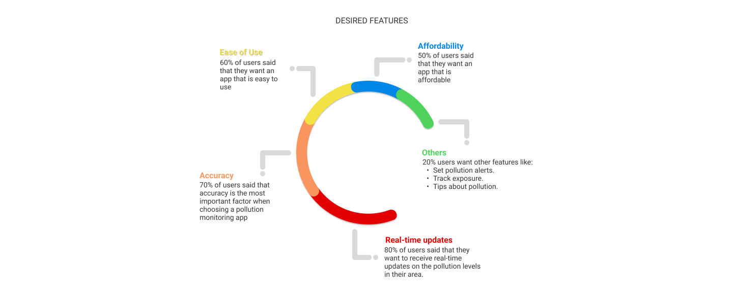
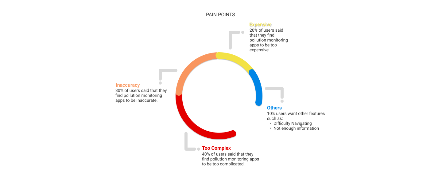
Based on the survey results, the findings were divided into the Desired Features & Pain points. This was necessary since a lot of users were already using another monitoring app.
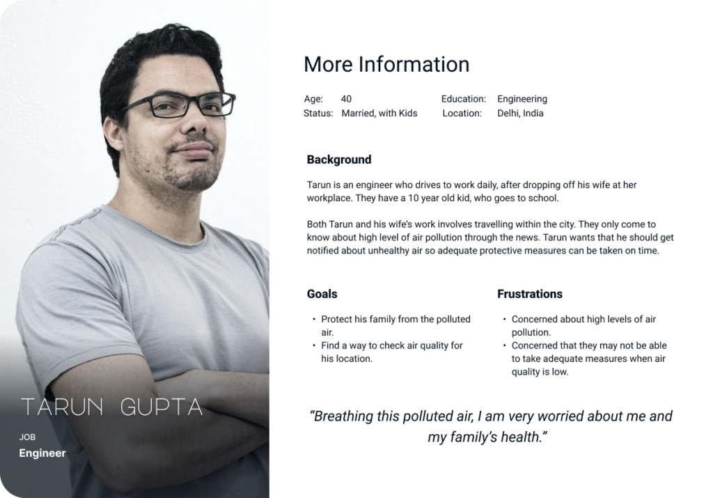
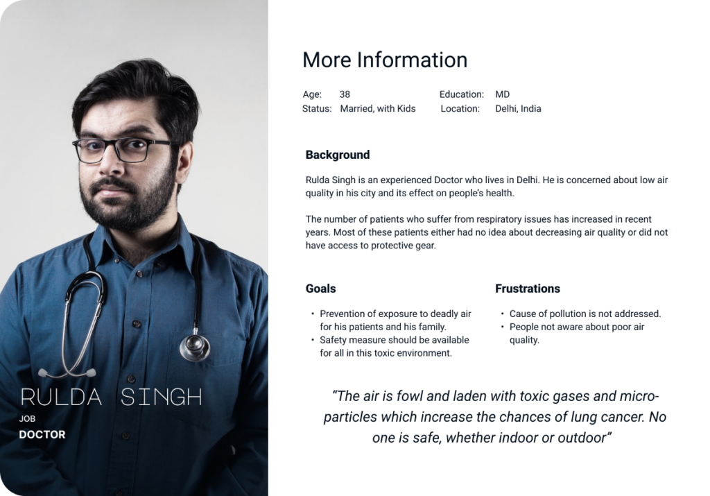
Personas
Personas help create empathy for the users. By understanding user’s motivations, goals and pain points valuable insights on why the user is using the product & what they are hoping to achieve. This helps in creating a product that are more user-centered and meets the need of the user.
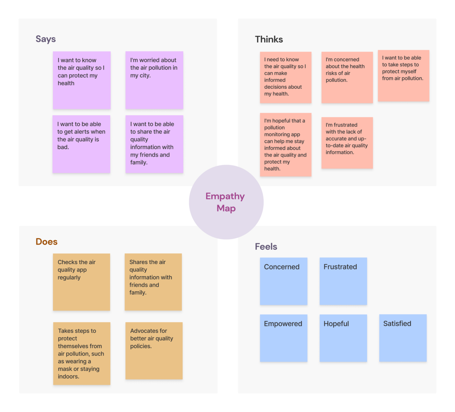
Empathy Map
The aggregated empathy map can help us to understand the needs, wants, and pain points of users who are looking for an air pollution monitoring app. This information can be used to design an app that is user-friendly, accurate, and informative.
Some specific features that could be included in the app based on the aggregated empathy map:
Real-time air quality data.
Ability to track air quality over time.
Alerts when air quality is bad.
Sharing of air quality information with others.
Educational resources about air pollution.
The Design Phase
It is clear from user research that our app needs to have the following feature set:
Real-time tracking and updates.
Alerts when air quality is bad.
Accuracy and ease of use.
Sharing of air quality information with others.
Educational resources about air pollution.
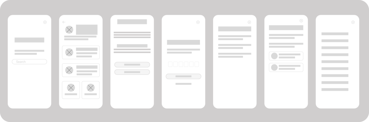
Wireframes
The wireframes for the app were created using Figma. This allowed us to quickly and easily iterate on the design and get feedback from users.
These wireframes were used as a base for low and high fidelity prototype stages.
Design System
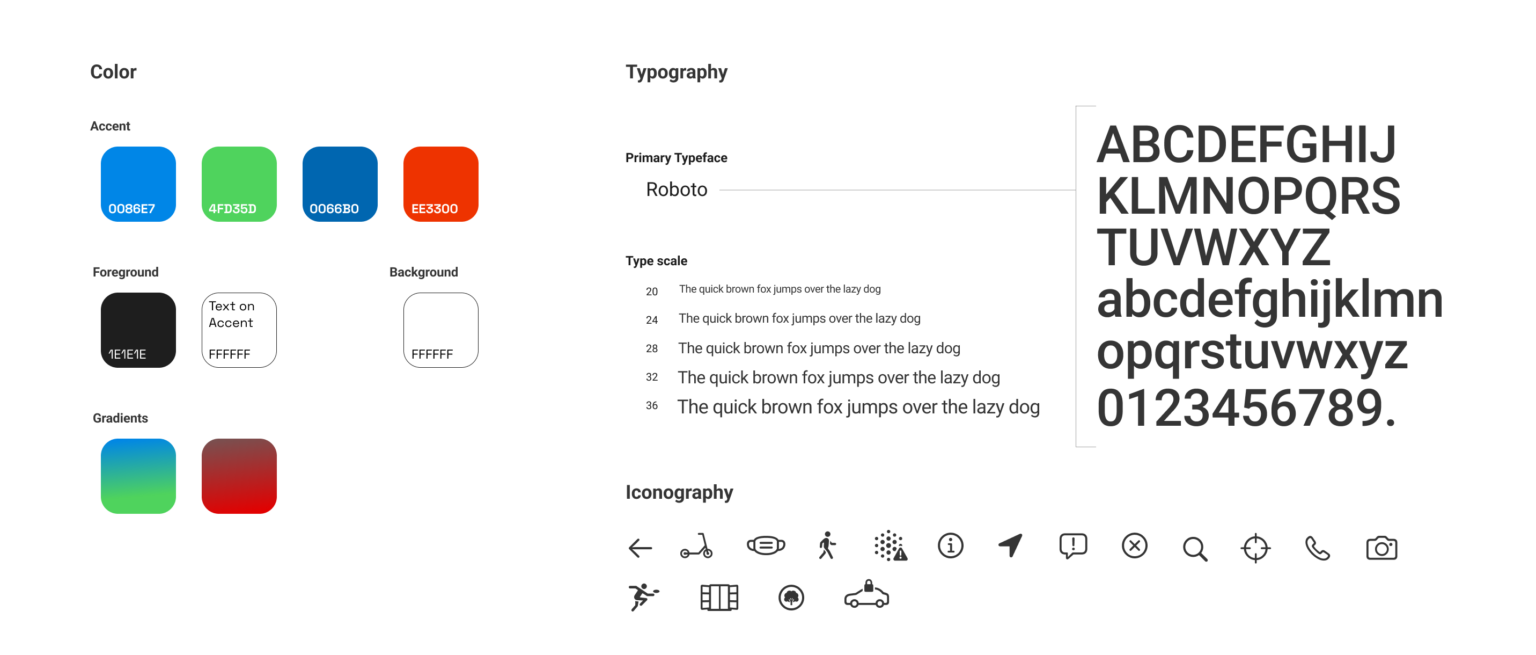
Colors
The colors used in the design system are based on the following principles:
Contrast: The colors are chosen to provide good contrast, so that the text and other elements are easy to read.
Clarity: The colors are chosen to be clear and unambiguous, so that users can easily understand the meaning of the different colors.
Consistency: The colors are used consistently throughout the app, so that users can quickly learn to associate the different colors with different meanings.
The specific colors used for each purpose are as follows:
0086E7: The light blue color is used as the background for information pages. It is a calming and relaxing color that is associated with peace and tranquility.
EE3300: The red color is used as the background for screens depicting low air quality, as it is a color that is associated with danger and warning.
4FD35D: This light green color is used as the background for good air quality. It is a color that is associated with health, well-being & universally signifies that “everything is okay” .
1E1E1E: The dark gray color is used for foreground text, as it is a color that is easy to read on a light background.
FFFFFF: White color is used for background and text on accent, as it is a color that provides good contrast and makes the text stand out.
The colors used in the design system are carefully chosen to be effective in communicating the information to the users and to help them quickly understand the relevant information across different areas of the app.
Typography
Ease of readibility is of paramount importance so that the conveyed information is quickly understood by the user. The need of the hour was a typeface which is familiar, legible at all screen sizes, modern and friendly.
“Roboto” is arguably the most widely used font across the web. It is very likely that a user has interacted with a website/app which used Roboto, since it has been the default Android typeface, and the default font for Google Play, YouTube, Google Maps. This makes Roboto an excellant choice from readability standpoint.
Here are some more reasons why Roboto is a good choice for this project:
Clear & concise: Roboto is a sans-serif typeface, which means that it does not have any serifs, or small strokes at the ends of the letters. This makes it easier to read on small screens, such as the screens of smartphones and tablets.
Readable: Roboto is designed to be easy to read, even on small screens. The letters are well-proportioned and the spacing is consistent. This makes it easy for users to scan the text and find the information they need.
Versatile: Roboto is available in variety of weights, from light to bold. It can be used for headlines, body text, and even icons. This makes it a good choice for an app that needs to be visually appealing and functional.
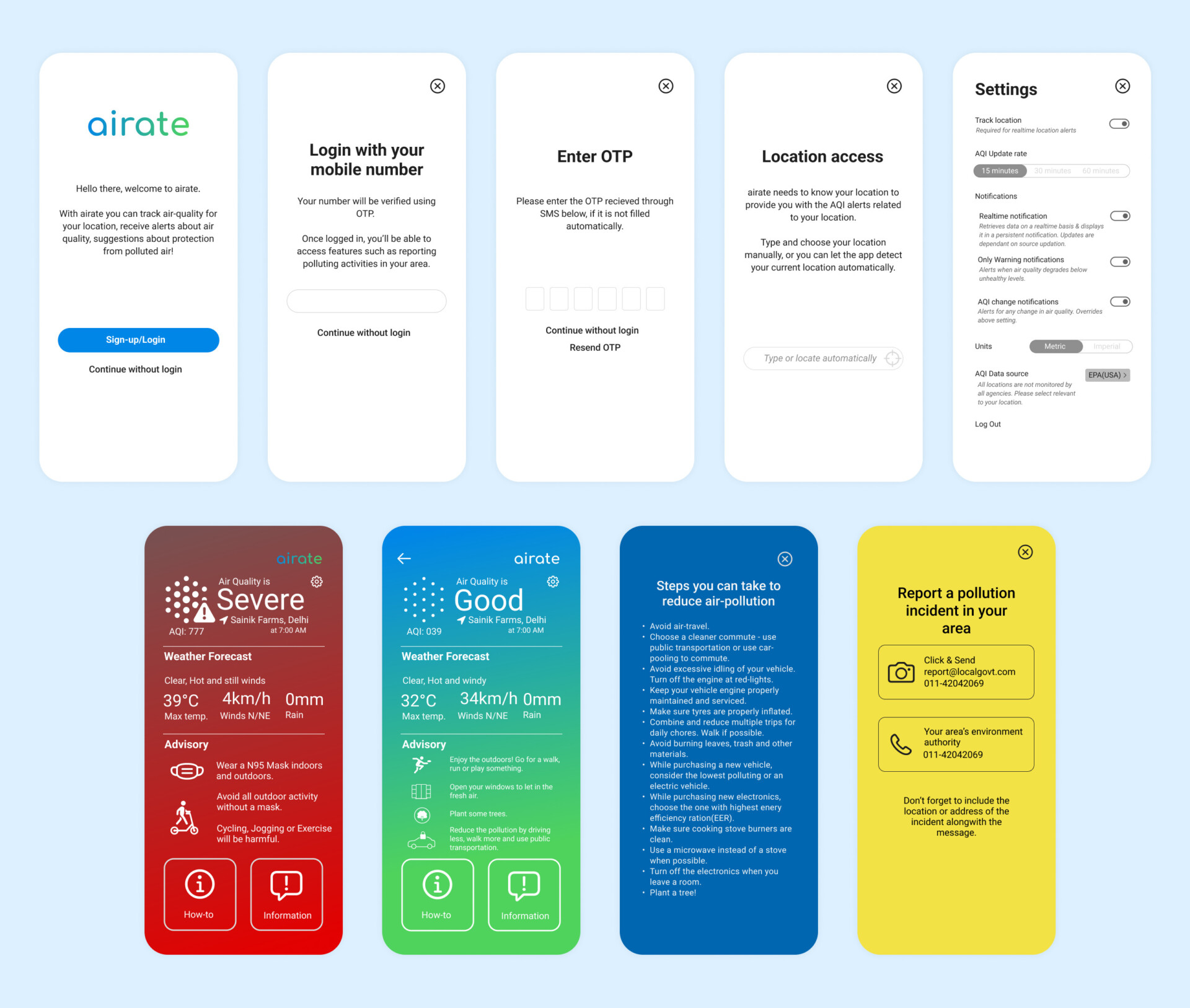
Final Design
The final design of the app allows the user to check the air quality of his current area quickly without little distraction. The user can also choose to be notified in real-time about the air quality.
Experience can be further customized by choosing the Update interval, Units of measurement and Data sources. Ability to report the polluting activities to relevant authorities has been added as well.
Let'sConnect
Get in touch to discuss a project, or just to say Hi! 👋